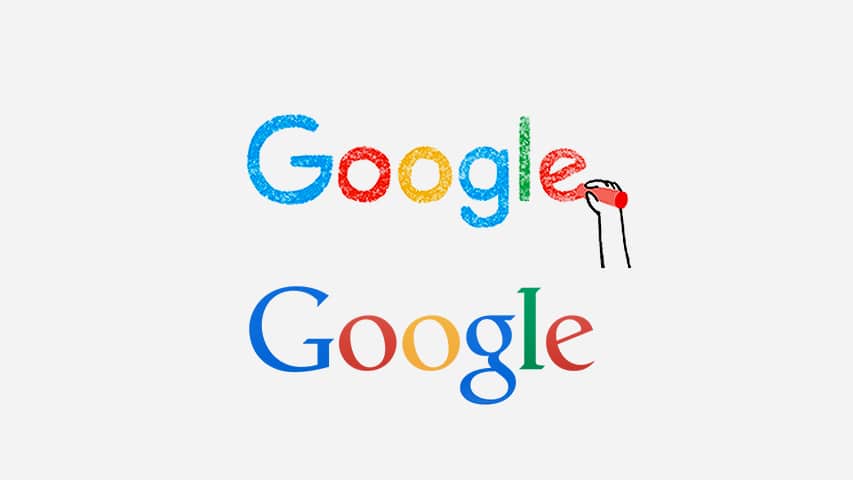
This week, Google finally did it. They swapped their classic, bookish wordmark for a simpler and more contemporary sans-serif look. News of this change hit the Google Blog Tuesday morning, sending tech sites into a frenzy. And, really, it’s been a long time coming.
Why Did the New Google Logo Take So Long?
We use Google products all the time here. But as Google navigation and product icons have become increasingly clean, flat and simple, the old-school logo felt more and more like it just wouldn’t die. Seeing the reveal, it’s tempting to wonder why it took so long.
Because – Duh – Getting to ‘Simple’ Is Not Easy
Ah yes. The myth that simplicity is easy. It was seeping into our thoughts, and thank goodness we caught it before it overtook us. As we know, the simplest and most scalable brand solution is often the product of a great deal of unseen planning, and design problem solving. (We have had this conversation with clients before.)
The New Google Logo Is Just the Tip of the Iceberg
It may seem small, but the new Google logo is the product of a much broader branding effort. And that effort is driven by a refocusing of the search behemoth’s brand strategy to better reflect the seamlessness of cross-platform Google apps. Paraphrasing the Google Blog post, you can have the same magical experience on desktop or mobile, regardless of whether you’re tapping, typing or talking to the interface. Their brand needed to fully embody this.
The Logo Has an Entourage
The new Google logo keeps the primary colours we are used to. But it comes with a reveal animation, and a four-colour ‘G’ icon that drive home the message. This is a great example of how a logo is not the same as a brand. It is a customer’s first impression – yes – but it comes in the context of other design and copy elements that define the identity.
We will be keeping our eye on Google as their fresh look and feel trickles down to their products. To stay in the loop, follow us on Facebook, LinkedIn and Twitter.

