

One of the first things you notice about a brand is its colour. Whether it’s leader red, conservative blue or friendly orange, colour makes a vital impression. Not only does it establish a mood, it makes a brand recognizable.
Your Colour Palette: What’s the Point?
A great visual identity is dominated by one main colour, and accented by a secondary palette. The main colour stands apart from the colours used by the competition. Look at Coke and Pepsi: it’s a classic case of red vs. blue. Colour helps us instantly separate the two products. Or consider brands like Tangerine, Orange or Blue. They’ve gone so far as to name themselves after their brand colour to be extra memorable. Either way you slice it, colour can help us choose one offer over the rest.
Colour Helps You Stand Out
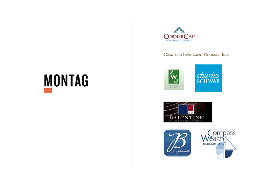
Here’s another quick example from our own work. Below you’ll see the wordmark of an investment management firm we rebranded – Montag. We used orange for many reasons. But our decision was driven largely by their need to stand out in an industry oversaturated with conservative blue brands. So we chose the opposite of blue on the colour wheel. You guessed it, orange.
More to a Colour Palette Than Meets the Eye
Because colour is so critical to the uniqueness of a brand identity, it needs to be carefully managed. Imagine all the marketing materials Coca-Cola has that feature Coke red. Business cards, billboards, websites, apparel, environments, vehicles and the list goes on. These touchpoints come in the form of digital, print and other media like industrial paint. They all require different colour formats – maybe even different formulas – to reproduce the same red.
Colour Formats at a Glance
Screen and digital media use red, green and blue (RGB). Four-colour process printing uses cyan, magenta, yellow and black (CMYK). Spot colour printing uses the Pantone colour matching system (PAN) for premium results. Every brand will encounter at least two of these formats. So be aware of the difference, and ensure you have someone on board who can match your colour reproductions to the intended palette.
More About Colour Palettes + Other Brand Design Elements
Be on the lookout for our free new ebook How to Build a Visual Identity, available this April. It’s full of best practices for executives that want the most brand for their buck. Approaching the launch, we’ll be posting visual identity dos and don’ts every week. So stay tuned. Next time, we’ll take a look at great brand typography.
Be in the loop and subscribe to the Distility blog.