A great brand identity can really drive social media engagement. Sounds obvious, but a lot of companies overlook one critical piece of online infrastructure: the social media icon.
The Sad State of Social Media Icons
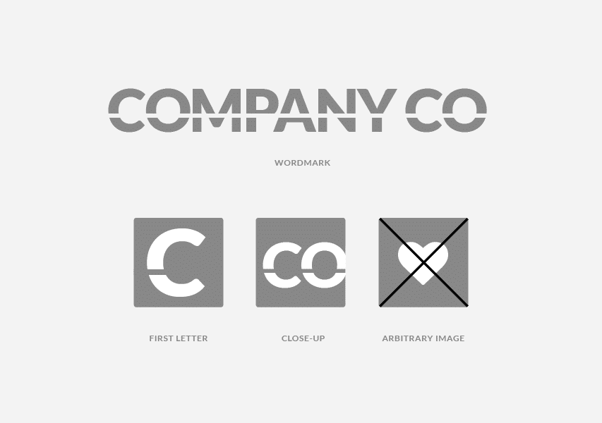
A social media icon is the small square image that acts as a brand’s profile picture. In a way, it’s sort of a face. It should require next to no interpretation, and it should be easy to recognize. Many small to mid-size companies don’t quite get this. They choose an arbitrary image for their social media icon, with no tie-in to their brand signature. Or they sport a long brand name that becomes unreadable at smaller dimensions.

What Makes a Social Media Icon Shine
Here’s the thing, the average brand needs a social media icon that strikes a balance between style and substance, because it might be someone’s first point of exposure to that brand. That’s why we always recommend a direct screen adaptation of your wordmark, whether it’s a close-up of the most memorable detail or the whole shebang. But wait. Before you get there, we also recommend that your wordmark be designed with the social media icon in mind 😉

More About Social Media Icons + Other Brand Design Elements
Look out for our free new ebook How to Build a Visual Identity, available this April. It’s full of best practices for executives that want the most brand for their buck. Leading up to the launch, we’ll be posting visual identity dos and don’ts on the regular. So stay tuned. Next week, we’ll take a look at what goes into a great colour palette.
Be in the loop and subscribe to the Distility blog.
