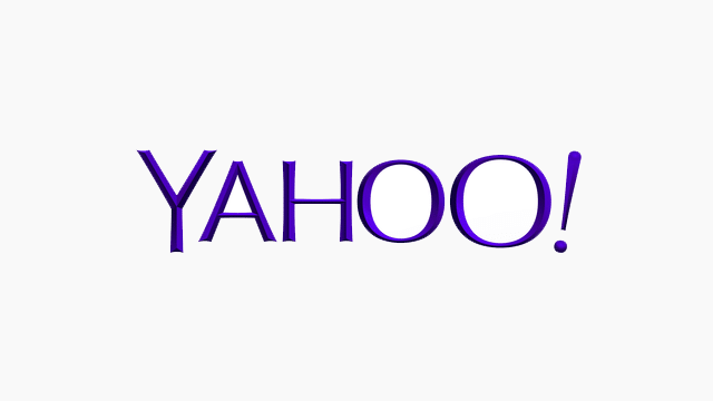
Today the tech world was abuzz with the unveiling of the refreshed Yahoo! logo. Last night, the web giant revealed this new design on their Tumblr page.
The purpose of the Yahoo! logo rebranding was to bring the Yahoo! look and feel up-to-date with their effort to up the sophistication of the Yahoo! user experience, without losing the fun. But considering the difficult history of this brand, there has been a mixed bag of reactions to the Yahoo! logo rebranding reveal. Here’s our general consensus.
The New Yahoo! Logo Design
The new logo is more visually pleasing. It maintains the all-caps feel of the old logo. However, it uses a more traditional typeface, clearly stylized with dynamic sizing, though still perfectly legible. We also like the more sophisticated purple that was chosen for the colour palette evolution. These elements allow the new logo to retain the brand’s enthusiasm while shedding the more juvenile feel of its past incarnations.
Yahoo! Logo Rebranding – No Avatar?
Though it is a visible evolution, the new Yahoo! logo rebranding has not included a prominent avatar. An avatar is the small square image used on social media pages to display a key brand image. It has to be visible at sizes as small as 16 x 16 pixels. In its tiniest inception, an avatar is put to use as the square icon on the tab of a webpage (in this case, it’s called a favicon). To be super-readable, an avatar is often a treatment of a brand’s initials.
Currently, Yahoo.com still employs its old “Y” avatar on its homepage. Though there is a redesigned favicon in use on the site, it is easy to miss. Stranger is the fact that Yahoo! social media sites aren’t using a new Y avatar yet. Rather, they use the full logo as the image in that very small square space, which isn’t great for quick brand recognition.
Why Avatars Rule
Here at the MaRS Centre, we’ve had some interesting water cooler conversations with fellow tech enthusiasts. The people we talk to seem to relate Yahoo! most strongly with the old Y avatar that appears in apps like Yahoo! Mail. This suggests that a good avatar is as important – if not more important for a digital service – than a logo displaying a company’s full name. This is especially true with the rise of mobile.
All the work we now do for clients in the tech space includes the development of winning avatars. So that’s why we have to ask Yahoo! “Hey! Where’s the avatar?”
See the original Yahoo! logo rebranding Tumblr post here.
To learn more about avatar design, follow us on Facebook, LinkedIn and Twitter.

