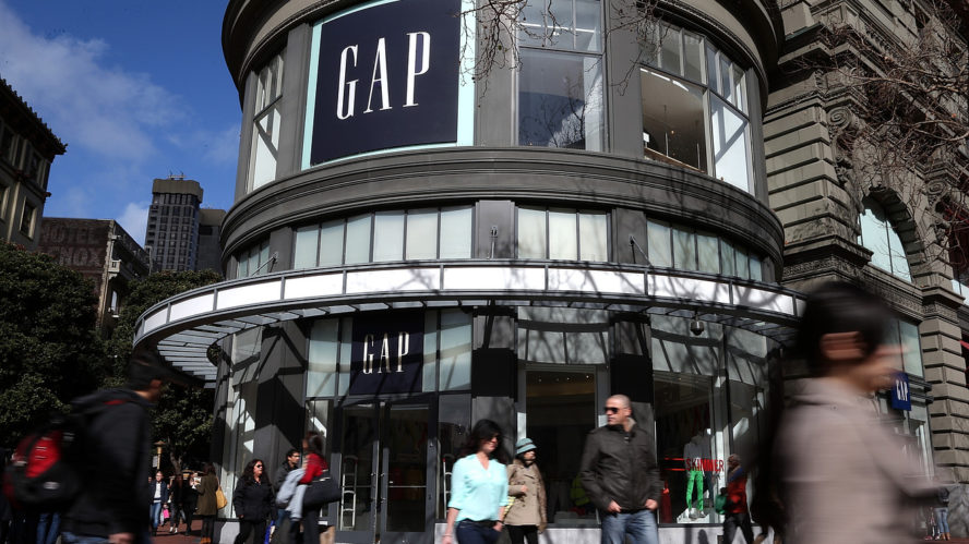
The interwebs are abuzz with the new GAP wordmark. People are shocked, enraged, agog. Productivity is down. People want answers. Emails are flooding my inbox. The Distility social graph wants to know where we stand. Neither wordmark is particularly inspired. But then how inspired is that of Dolce & Gabbana or Calvin Klein? So it comes down to business.
Will the new logo help increase awareness and value for the GAP?
Yes. Here’s why…
 Effcient Shape = Higher Awareness The old wordmark was square. A bad display shape. There are no square TVs or square movie screens because the square does not fill a person’s field of view. By dint of being a landscape rectangle the new GAP wordmark will be bigger. Look above and compare the new and the old. On any landscape display the type “GAP” is almost three times as visible. It will be more visable, be it from a faraway billboard, or when it is squeezed into the the header of a webpage. That means higher brand awareness.
Efficienct System = Higher Brand Value
The new wordmark matches the same helvetic font that the GAP uses magnificently in all their advertising and displays. It is this font that I see in every add, in every window, and on every tag that I associate with the experience of the GAP, far more than the dimunitive former logo. When the new wordmark mirrors the marketing and sales experience I enjoy and expect, it builds overall brand value in my mind.
This is Not Over
Eventually, the GAP team will remove the blue square from their wordmark. There’s nothing special about it.
Care to disagree? Your comments are welcome below…

