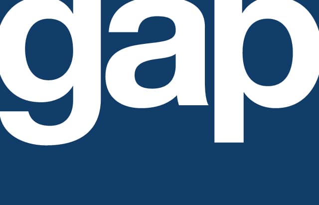
I took some heat for my last post on how the new GAP logo was better. In that post, I explained how the old square shape makes it smaller than competitors, and how the old serif font is out of tune with their otherwise ubiquitous use of Helvetica.
Soon after my post, the GAP responded to the “gapocalypse”. First, saying they would use the outcry (“engagement” in their speak) to try again by crowdsourcing their logo. And then, when the design community reacted with even greater outrage, deciding that they would just keep with the old logo ad infinitum. End of story.
So what can we learn?
Lessons For Brand Holders Like the GAP
- 2009 to 2014 will see more change in the marcom industry than all of the change we’ve experienced since the Mad Men era. You cannot take anything for granted in this sci-fi day and age. Check all your mental models before you plan to ship.
- In this case, the GAP assumed the crowd didn’t care. Don’t make the same mistake. This ain’t up there with the 1985 New Coke disaster but it has the same taste.
- The GAP assumed they could solve their problem with a crowdsourcing contest in time for the holidays. For gold-plated brands, great crowdsourcing is a campaign unto itself, nothing less. Case in point: I went into my corner store this summer and saw a bag of Dorritos that had no name, and a contest to come up with a name. That kind of thoughtfulness will garner respect from the creative community, rather than the anger the GAP got from designers who see crowdsourcing as a threat to their values.
Lessons for Logo Designers
Since the weekend, I’ve seen hundreds of GAP logo designs that have sprung up in various online contests and forums. What concerns me is how many of the ones clearly done by brilliant artists miss the mark on the importance of shape, the value of simplicity, and the importance of continuity.
- Logos should be landscape rectangular to fit the human field of view. Square or round logos will always be smaller, and therefore less viewed than rectangular competitors.
- Logos should be the simplest thing that works. For example, if a name says “GAP” you don’t need to actually draw a gap. If a name says “Tide” you don’t need to show the sea.
- When the brand is a big part of people’s lives, continuity is king. Change your brand so the audience sees evolution, not revolution.
With these lessons in mind, Todd Major and I threw together in a few minutes the wordmark above. It mirrors a safer, saner, best pratice-ier direction that would have stuck.
What best practices do you think the GAP should have followed? Let the Distility social graph know below.

