York1: How 6 Brands United as 1
The Challenge
Over seven decades, the York Group of Companies built a reputation for excellence in the environmental and infrastructure industries. They’ve participated in some of Southern Ontario’s most noteworthy projects, including the Rogers Centre and CN Tower. When President and COO Brian Brunetti approached Distility, he was looking for advice on managing all the company’s brands while anticipating more acquisitions on the horizon.
Architecting a Unified Brand
Distility started to weigh the options on the best path to take. Should the different companies exist independently? Or come together as one brand? After brand analysis and careful consideration of the best brand architecture, Distility recommended that York unite their companies under one masterbrand.
Analysis and Research
Distility interviewed York employees, customers and industry analysts to establish a competitive landscape, including competitors’ brand promises, positions and personalities. All of this groundwork culminated in the Distility brand workshop. Over a single day, Distility brand strategists brought the York executive team together, creating a consensus for their new brand and producing a 1page brand strategy that included a masterbrand promise, position, personality, purpose, vision and values.
A New Name for a New Masterbrand
To get a sense of the team’s preferences, Distility strategists presented Brian and the executive team with naming criteria, domain and trademark requirements as well as a small sample of invented, suggestive and semi-descriptive names. After brainstorming and screening more names, the team was presented with a shortlist that embodied the brand. These names had also been cleared for trademark availability, and .com domains of the name were for sale. Ultimately, the team chose York1. They felt it balanced the company's past with its future, preserving the York name while aligning with the team's purpose to unite the best and build a better kind of company.
"Working with the Distility team was very easy. The team was professional, customer-centric, active listeners and supportive throughout the entire process. We are very proud of our new brand identity and website, which has helped us bring together multiple companies and become one team. It was a pleasure working with Distility. Thank you for caring as much about our brand as we do."
- Anthony Di Maulo, Vice President of Marketing at York1.
Creating a Cohesive Visual System
Arriving at a winning new masterbrand identity is more than a creative challenge. It is personal. Some stakeholders are resistant to change. Most teams will have a healthy difference of opinions when it comes to how a new brand should look and feel. The danger, even with the best clients, is design by committee. Distility projects anticipate and solve these potential roadblocks by inviting company brand teams to actually build their brand strategy together. This helps companies align on the message and desired personality of the brand. After just two meetings with York1, Distility strategists were able to bring the entire executive team together on a new look and feel.
The Concepts
First, the Distility design team put together three competing visual systems, each with a unique concept connected to their brand strategy.
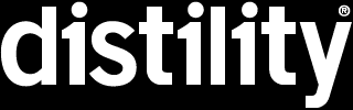
Concept One: “Get It Done Right”
Based on the brand promise, this concept highlighted the company’s commitment to delivering peace of mind performance to all of their clients.
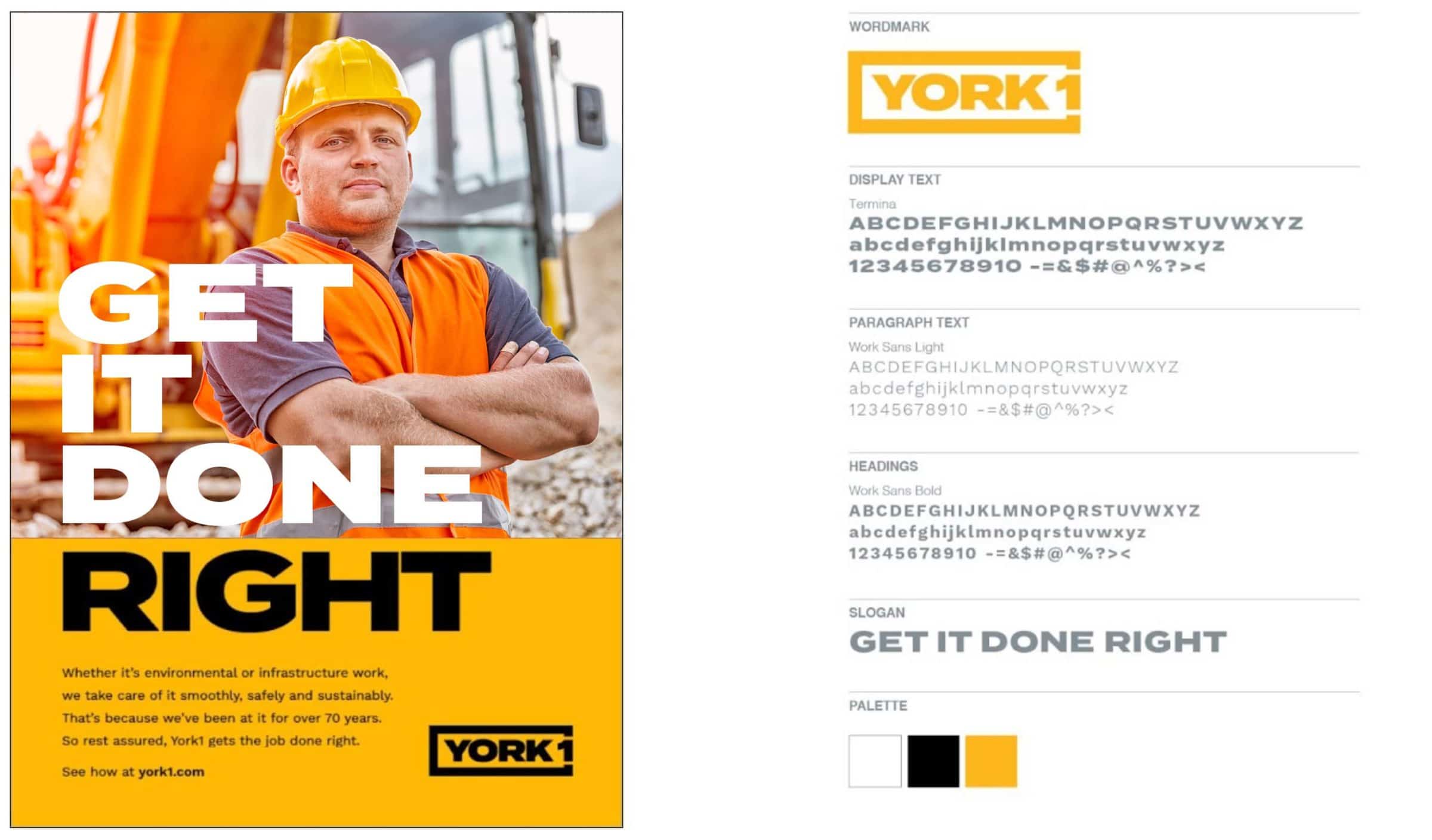
Concept Two: “70 Years Strong”
This concept was connected to the brand position, which emphasized the company’s storied history in the environmental and infrastructure industries.
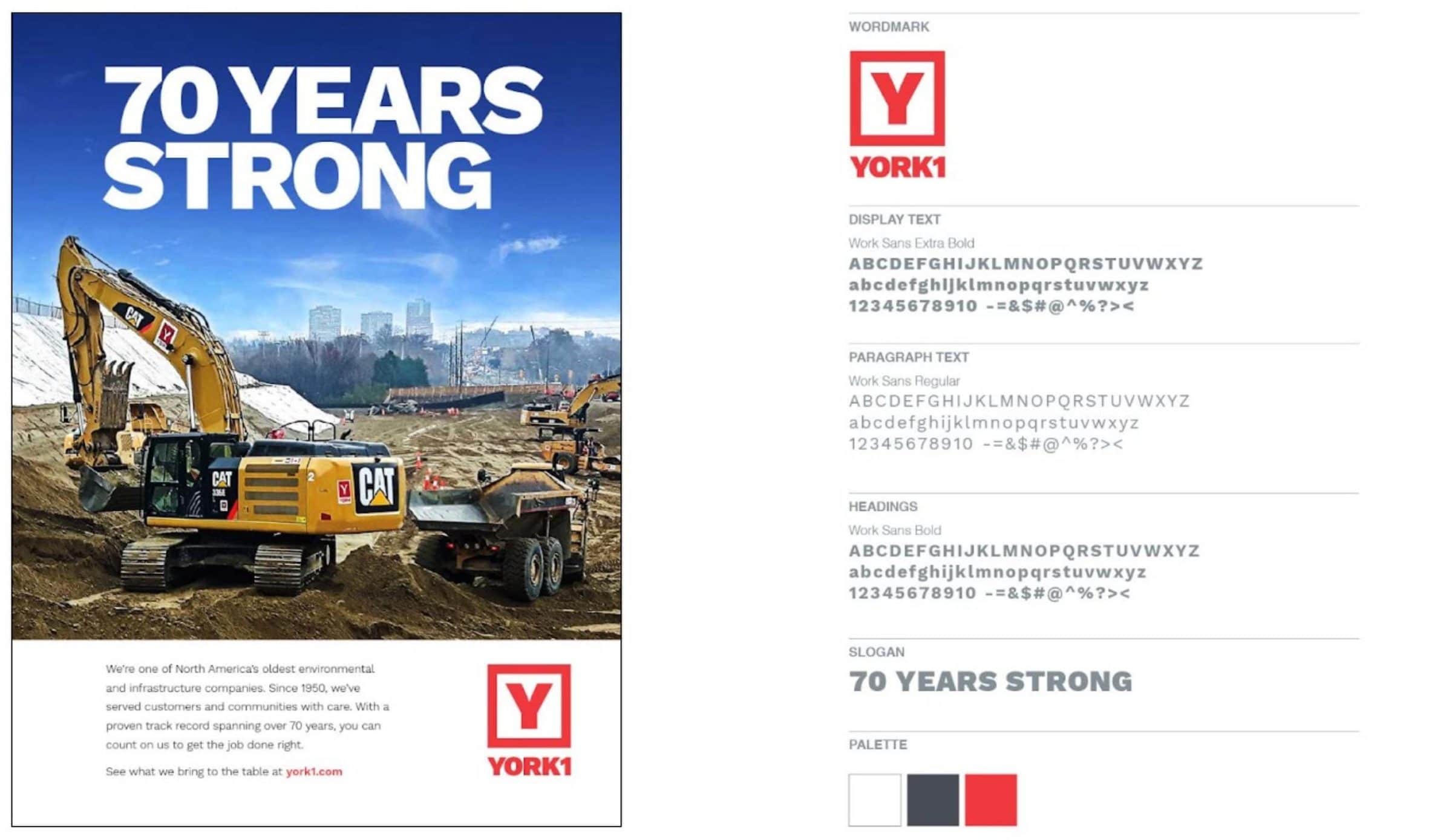
Concept Three: “Unity”
The Unity concept reflects the company’s purpose and values to build a better future by uniting the best in their industries. After deliberating whether to lead with their promise, position or purpose, the team decided that the Unity concept was the winner. It offered a magnetic call to customers, represented the firm’s environmental commitment and left the door open to future family-run and like-minded businesses. From a creative perspective, the Unity concept had great creative potential, including a new logo and their new “1 For All” tagline.
Font, Colour Palette + Logo
Distility needed to help York1 differentiate from their competitors. The York1 team preferred the bold font from the Get it Done Right concept but the overall look and feel of the Unity concept. After testing how the font worked with the bright cyan colour palette, Distility designers agreed that the two worked well together. Not only did cyan create a vibrant and airy design, but competitive analysis showed that using cyan would help distinguish York1 from the typical colours found in the industry. As for the logo design, its cyclicality visually represents one unifying force connecting different companies together.
Photography + Visual Treatment
Imagery in these industries focus on machinery and heavy equipment, but York1 wanted to add a human element to its identity. So, the design team built a library of photos and videos that featured people and clients working together to reinforce the collaborative approach that York1 takes in its projects.

Bringing the Brand to Life
Translating the new look across York1 digital and physical properties was an exciting process that helped bring the designs into the world. From vehicles, signage and bins to stationery and a whole new website at york1.com, the Distility design team helped York1 realize its vision across different mediums.