
Jack.org Gets Bright New Brand With Distility
The Organization
Jack.org is a national charity that inspires and empowers young people to be leaders in creating conversations about mental health and encouraging their peers to take care of themselves and each other. The organization was launched in 2010 as The Jack Project at Kids Help Phone in the name of Jack Windeler, a Queen’s University student who died by suicide. Since its launch, Jack.org has raised more than $3 million and launched several dynamic initiatives that engage thousands of young people across Canada each year.
The Challenge
In July 2013, The Jack Project registered as an independent national charity to drive continued growth and focus on a new strategy that included school chapters, student talks and a national summit. As the organization approached this turning point, its staff recognized the need to revisit The Jack Project brand. “After three years, the brand needed to move beyond its origin as a memorial fund,” says Eric Windeler, father of Jack and co-founder of The Jack Project.There were also problems with the charity’s sub-brands. Over the last three years, The Jack Project had spawned numerous events under different names, including its Unleash the Noise student summit and The Jack Ride cycling event. “We fell into a trap where we would call every initiative something new and we were struggling to manage all these sub-brands and urls,” recalls Eugene Michasiw, the charity’s digital strategy lead. “This also created confusion among our audience, because it wasn’t always apparent that The Jack Project was behind any of these events.”
The First Steps Forward: Clarity Around Brand Naming
The Jack Project’s leaders decided it was time to rebrand and reached out to Axle Davids, CEO of Distility, a Toronto branding agency. Working with Davids, the team at The Jack Project achieved clarity around the charity’s purpose, beliefs, audiences and how other like-minded organizations were branding around the world.
Next, the projects leaders went through the Distility Brand Architecture workshop, which yielded a new, simpler way to name and organize the charity’s initiatives. A new name for the organization also emerged: Jack.org.
“Jack.org recognizes Jack’s legacy and yet says much more,” explains Davids. “It’s so much more than a project, it’s the go-to destination where youth are empowered to become mental health leaders.”
Gathering Audience Insights Through Fan Branding
Distility began setting the stage for its Distility 1day1brand workshop, a proprietary process and workflow that enable participants to distil their ideas and, by the end of the day, reach consensus on a new brand promise, personality and position.
In a unique move, Davids recommended that Jack.org gather insights directly from its target audience by setting up a branding collaboration page on Facebook and feeding the insights into the Distility 1day1brand workshop. Through this “fan branding” project, about 30 young people across the country shared their ideas on topics ranging from which mental health and other brands resonated with them, to what they would like to see from Jack.org.
“I thought it was cool that we were asked for our input,” says Molly Schoo, a Western University student and one of the Facebook fan branding participants. “We were asked questions like what colour we would like to see with the new brand. I chose blue because I think it’s a calm and soothing colour that’s more associated with youth.”
A New Brand Identity – In a Single Breakthrough Day
Armed with this wealth of information, Jack.org was ready for the Distility 1day1brand workshop. Hosted at MaRS Discovery District, an innovation centre in Toronto, the workshop involved a mix of participants, including Windeler, Michasiw, a fundraiser, a board member and youth advisory members.
Max Silverbrook, one of the youth advisory members at the workshop, recalls how he found the prospect of defining a brand in a day quite daunting because of his university experiences in decision-making within a large group.
“But the Distility process and touch screen technologies allowed us to communicate freely and work with the collective focus needed to make the best decisions for the brand,” he adds.
“People saw how their viewpoints and the insights gathered from the Facebook groups were being interpreted and included, broken down and distilled to that one crucial focus,” says Michasiw. “Everyone was impressed with the process and the results.”
By the end of the day, the participants had all agreed on a new brand promise, personality and position. Distility captured these brand pillars in its Distility 1Page Brand Strategy, which it handed out to all participants.
“We were not all necessarily on the same page coming into the workshop,” says Windeler. “But coming out of it, we all felt that the core concepts we had arrived at worked and represented all aspects of the organization.”
What was particularly significant, adds Windeler, was the organization’s newly defined focus on youth leaders. Instead of just addressing young people in general, Jack.org would now empower youth leaders to drive initiatives in their communities.
An Efficient Visual System With Youth Appeal
Shortly after the Distility 1day1brand workshop, Distility and its design partner, Toronto-based Pod 10 Art & Design, presented their proposed brand visual system to the leaders at Jack.org.
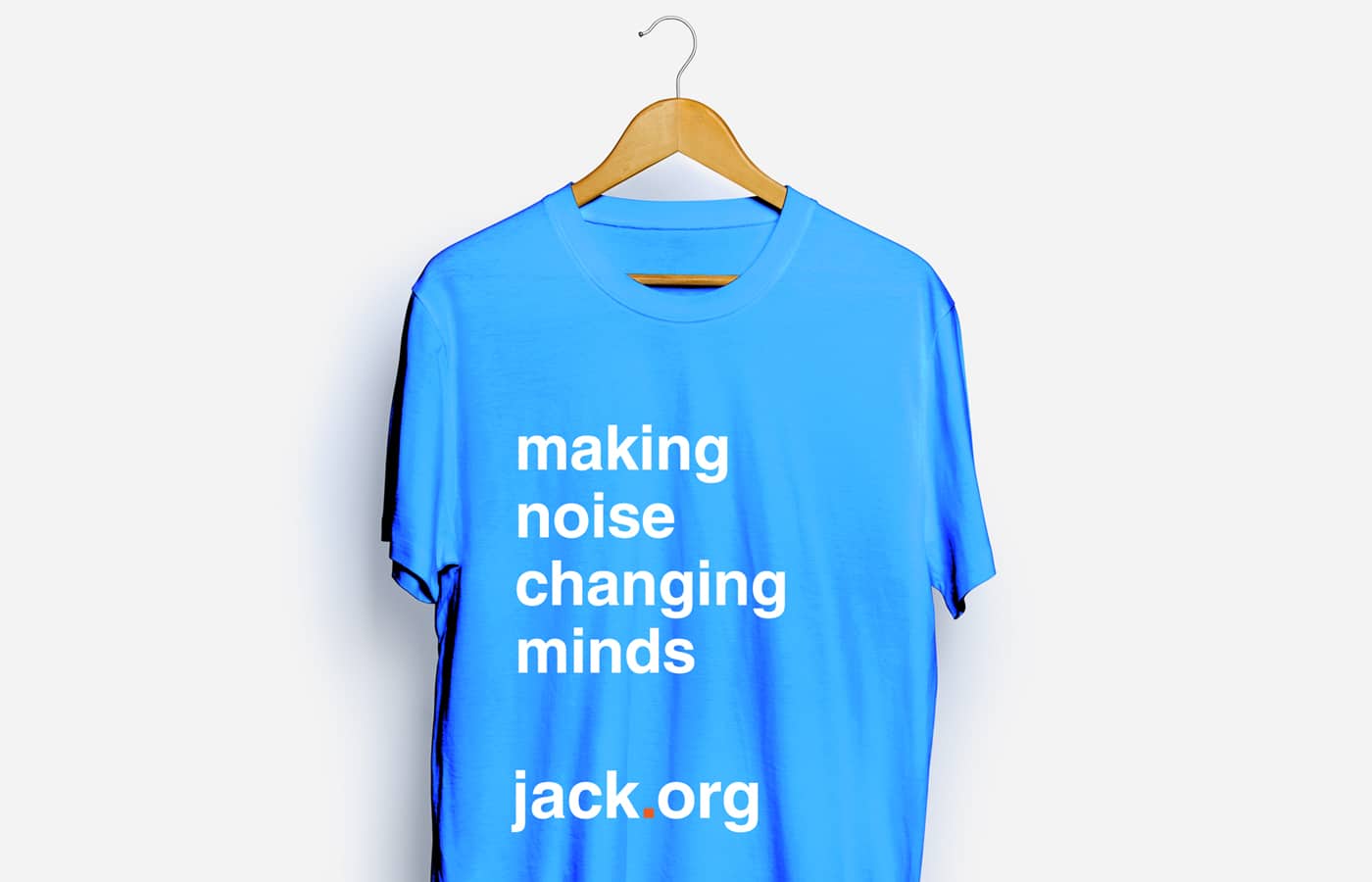
In the new design, all sub-brands are preceded by “Jack” and all event urls start with “jack.org” followed by a forward slash and the event name. Visually, the brand is conveyed in optimistic colour palettes. “It has a universal feel,” says Carmen Dunjko, graphic designer and founder of Pod 10. “It’s bold, but not affected.”
One of the unique characteristics of the Jack.org visual system is the absence of a graphic logo. The organization’s name, in Helvetica font, serves as brand, logo and website address – all in one visual expression.
“We really simplified our brand to one that I think is not only incredibly powerful but also incredibly clever and energetic,” says Windeler. “Our mark, logo and url are one and the same. It’s easy to remember and at the same time it’s a constant call to action; every time you see the brand it’s a reminder that you need to go to Jack.org for more information, or to get involved.”
The logo-free visual system makes it easier to use the brand in event communications, notes Schoo. But perhaps most important of all, the brand, with its clean lines and energetic hues, has definite youth appeal.