

Technically, a wordmark is not the same thing as a logo. With a wordmark, you’re treating your brand name itself as a piece of marketing art. With a logo, you’re aiming to create a symbol that will one day (if you have a huge marketing budget) stand in place of your name.
Why Wordmarks Work
As you may know, we here at Distility are big believers in wordmarks. Why? They are pragmatic for the small to mid-sized firm. When done well, they up the equity of your brand name, because they focus attention on your name while signifying something compelling to your target audience.
But here’s the thing – a great wordmark isn’t just a cool font. It’s specially stylized text, geared for impact. For this reason, it can’t be competing with other brand elements like icons, illustrations or slogans. Unfortunately, we see bad brands break this rule all the time.
What Makes for Primo Impact?
See the wordmark treatments below. Note how each one focuses or fragments attention.
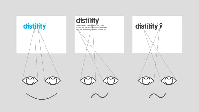
- The effective wordmark feels protected by the empty space that surrounds it. Having a clear boundary of negative space implies that the mark is more than just a name. The middle option neglects this.
- The effective wordmark does not use any secondary graphical devices. The option to the far right, on the other hand, splits attention between the brand name and the accompanying icon.
- The effective wordmark will work at any size because it doesn’t waste space. The option to the far right will be problematic for smaller applications.
When all is said and done, these rules can be broken. But only by a brilliant design solution.